Christmas Fonts and Holiday Card Design: A Simple Guide

Holiday cards, gift tags, shop banners, social posts: December is full of small designs that all need a festive touch. The font does most of that work. Pick well and the design feels warm in one look. Pick badly and even a beautiful photo looks rushed.
Choose the mood first
- Classic: elegant script and refined serifs, like an old-fashioned card. Works for formal greetings, family cards and luxury brands.
- Cosy and handmade: handwritten and brush fonts that look like they were written with a marker. Perfect for gift tags, bakeries and craft shops.
- Playful: bouncy, rounded and cartoon fonts. Great for kids, sales and fun social posts.
- Modern minimal: clean sans serif with lots of space. For brands and studios that want a calm, stylish season’s greeting.
Start with our Christmas fonts, then look at script fonts and handwritten fonts for more options.
Christmas fonts for this season
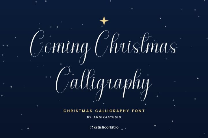
Coming Christmas Calligraphy
Personal
Welcome Christmas Calligraphy
Personal
Magical Holiday
Personal
Christmas Gift Calligraphy
PersonalPairings that feel festive
Flowing script + small spaced capitals
“Merry Christmas” in a script, with the family name or year in small, widely spaced capitals underneath. Simple, elegant and always in style.
Brush lettering + clean sans
The brush font gives warmth, the sans serif keeps details like dates and shop opening hours easy to read. Great for small businesses.
Playful display + rounded sans
Fun without being messy. Good for kids’ party invites and holiday sale banners.
Serif + serif italic
One serif family in regular and italic. Quiet, classic and very easy to get right.
The same basic rules from our font pairing guide apply: one font with personality, one that’s easy to read.
Laying out a holiday card
- One big greeting. “Merry Christmas”, “Happy Holidays” or “Season’s Greetings” is the star. Make it the largest thing on the card.
- A short message. One or two lines. Cards are read in seconds.
- A sign-off. The names, smaller, at the bottom.
- Space around everything. Empty space makes a card feel calm and expensive. Don’t fill every corner with snowflakes.
Colours that work
Red and green is the classic, but it isn’t the only choice. Deep green with gold, navy with silver, or cream with a single red accent all feel festive and a bit more refined. For thin script fonts, use a dark colour on a light background so the delicate strokes stay visible.
Mistakes to avoid
Script in all capitals
Script capitals are decorative on their own. A whole word in them is very hard to read. Use normal capitalisation.
Thin fonts on photos
A delicate script over a busy photo of lights disappears. Put text on a calm part of the photo, or add a soft colour block behind it.
Too many festive fonts
Three different Christmas fonts on one card looks like a sale flyer. Keep it to two.
Selling without checking the licence
Selling printable cards, tags or shirts counts as commercial use. Check the licence on each font page, and read our licence guide if you’re unsure.
Preview it before you print
Put your card on an invitation mockup or envelope mockup to see how it looks in real life before printing a hundred copies. For gift tags and jars, try label mockups.
Pick the mood, keep to two fonts, give the greeting room to breathe. That’s a holiday card people will put on the shelf instead of in the recycling.