Free Script Fonts for Wedding Invitations (and How to Use Them Well)

A wedding invitation is often the first thing guests see of the day. Before they know the venue or the colours, they see the names, and the font those names are written in sets the whole mood. Flowing calligraphy says romantic. A clean modern script says relaxed and stylish. A formal copperplate says black tie.
Below you’ll find free script fonts from our library that suit weddings, followed by practical tips that make home-made invitations look professionally designed.
Free wedding fonts from our library

Achiello Ascii
Personal
Varena Bricks
Personal
Standerd Bricks
Personal
Morque Bricks
Personal
Monocole Bricks
Personal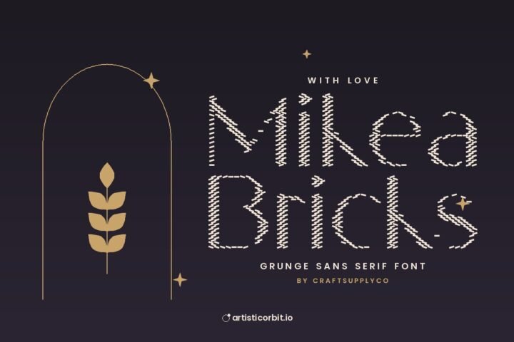
Mikea Bricks
Personal
Meditera Bricks
Personal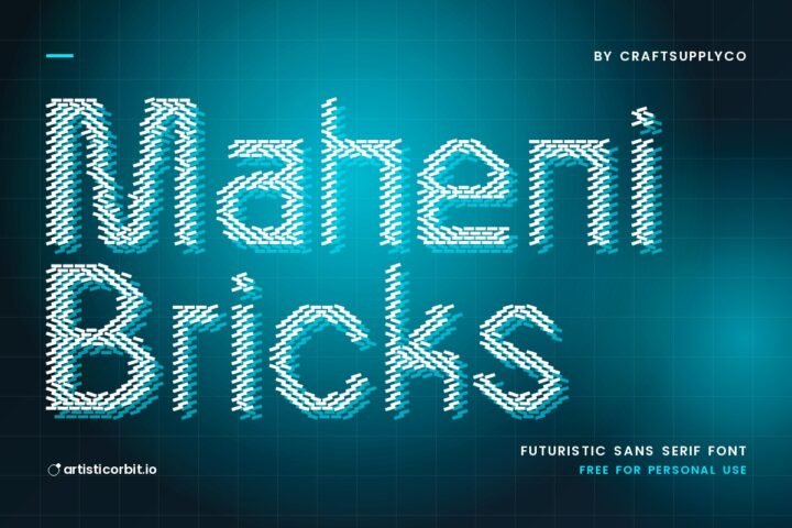
Maheni Bricks
Personal
Maginer Bricks
Personal
Lupina Bricks
Personal
Lochley Bricks
Personal
Levatta Bricks
PersonalWant more? See all wedding fonts, or browse calligraphy and script fonts.
Picking the right script for your wedding
Classic and formal
Look for thin and thick strokes with elegant loops, the style of traditional pen calligraphy. It suits evening weddings, ballrooms, churches and anything with a dress code.
Modern and relaxed
Brush-style or loose handwritten scripts with a lighter touch. Great for garden weddings, beach weddings and couples who want it to feel personal rather than formal.
Boho and rustic
Slightly rough, handwritten scripts paired with earthy colours, kraft paper and dried flowers. Barn venues and outdoor festivals love this look.
Signature style
Fonts that look like a quick personal signature. They’re lovely for the couple’s names or a monogram, and very on-trend right now. Browse signature fonts.
How to use a script font on an invitation
Use it for names only
The script is for the couple’s names and maybe one short line like “Together with their families”. Everything else, date, time, venue and RSVP details, goes in a simple serif or sans serif. Guests need to read those details quickly, often on a fridge door.
Never use all capitals in a script
Script capitals are decorative. A whole name in script capitals is almost unreadable. Type it normally: capital first letter, then lowercase.
Go bigger than you think
Script fonts look smaller than other fonts at the same point size because of the long loops. On a standard 5×7 inch invitation, names usually look right somewhere around 36 to 60 pt, depending on the font. Print a test on plain paper and hold it at arm’s length.
Watch the letters that touch
Some combinations create awkward joins or gaps. Look closely at the names. If two letters collide, adjust the space between just those two (kerning) in your design app.
Use the extra swashes
Many script fonts include alternate letters with extra flourishes, especially for the first and last letter of a word. In Photoshop and Illustrator you’ll find them in the Glyphs panel. One swash on the first letter of each name looks elegant. Swashes everywhere looks busy.
Pair your script with the right partner
A thin, elegant serif or a light sans serif in small capitals with wide spacing is the safest partner for almost any script. Keep the partner quiet so the names stay the star. Our font pairing guide explains why this works.
Printing tips
- Avoid super-thin fonts on textured paper. Hairline strokes can disappear on cotton or handmade paper. Choose a script with a bit more weight.
- Check dark text on dark paper. Gold ink on navy looks beautiful, but thin script strokes may need a slightly bolder font.
- Convert text to outlines (or send a high-quality PDF) when sending files to a printer, so the font can’t be swapped by mistake.
- Preview before printing. Put your design on an invitation mockup or an envelope mockup to see how it’ll feel in real life. It’s also great for sharing a preview with your partner or family.
A word on licences
Using a personal-use font for your own wedding is normally fine. If you design invitations for other people, or sell templates on Etsy, that’s commercial use and you’ll need the right licence. Each font page on our site shows the licence, and our licence guide covers this in detail.
Quick answers
What is the best font for wedding invitations?
A clear, elegant script for the names, paired with a simple serif or sans serif for the details. The best choice depends on the style of your wedding, formal, modern or rustic.
What size should the font be on a wedding invitation?
Names in script often look right around 36 to 60 pt on a 5×7 card. Details are usually 10 to 14 pt. Always print a test first.
Can I use free fonts for wedding invitations I sell?
Only if the font’s licence allows commercial use. Personal-use fonts are fine for your own wedding but not for invitations you sell.