Graphic Design Trends 2026: What’s Actually Worth Trying
Every January the trend reports come out, and every year most of them say similar things in slightly different words. This year is no different. Adobe’s list, the Envato and Vistaprint reports, the big Behance round-ups: they mostly agree.
What’s more useful is looking at what designers are actually making and downloading. The pattern is clear. 2026 is the year design stopped trying to look perfect. Here’s what that means in practice.
1. Things you want to touch
Puffy 3D letters, foil that catches the light, paper grain you can almost feel, plastic that looks squishy. Designers call it tactile or sensory design. After years of flat, clean screens, people want work that feels like an object.
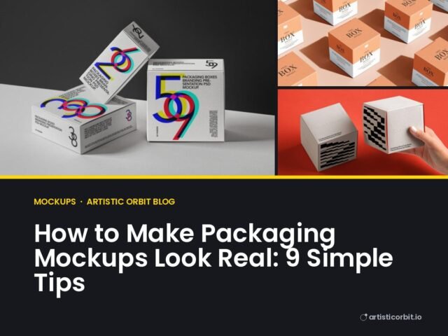
How to try it: you don’t need 3D software. Mockups do a lot of this for you. A logo placed on an embossed business card, a foil label or a textured paper bag instantly feels more physical than the same logo on a white square. Look for mockups with visible texture, like kraft paper, linen or frosted glass.
2. Big, bouncy, slightly silly type
Letters are getting louder. Oversized rounded sans serifs, bubble letters, wavy shapes and type that looks like it’s been inflated. You see it on snack packaging, café menus and a lot of YouTube thumbnails.
It works because it’s friendly. A brand that uses a chunky, bouncy font says “we don’t take ourselves too seriously” before you’ve read a word.
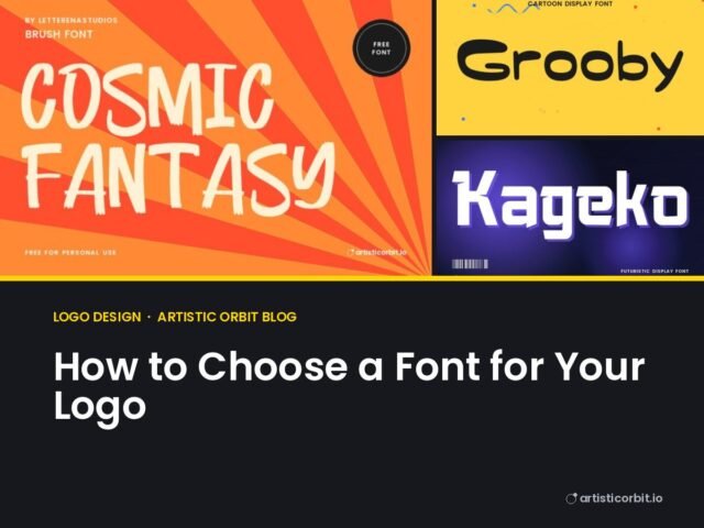
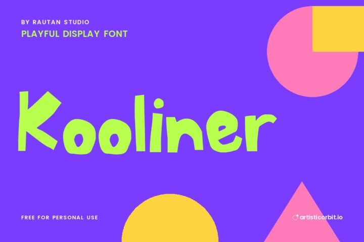
How to try it: use one playful display font for the headline and keep everything else calm. Two loud fonts at once is where it goes wrong. Our playful fonts and rounded fonts are a good place to start.
3. Imperfect on purpose
Hand-drawn lines, wobbly edges, scanned textures, letterpress ink that didn’t quite hit the paper evenly. With so much AI-generated imagery around, anything that clearly came from a human hand feels more trustworthy. Several trend writers put it simply: 2026 is about the return of human work.
How to try it: swap one clean element for a hand-made one. A handwritten font for a single line. A real paper texture behind your layout. A doodle in the corner. Small touches are enough. The goal is warmth, not mess.
4. Collage and layers
Photos cut out and stacked, torn paper edges, stamps, stickers, tape, scribbles on top. It looks like a zine or a scrapbook, and it’s everywhere on social media and in music and fashion branding.
How to try it: start with three layers only: a photo, a texture and one bold word. Add stickers or doodles last. Collage looks rich because of the layering, but it needs one clear focal point or it turns into noise.
5. Maximalism, but controlled
Bright clashing colours, lots of elements, big contrast. It’s the opposite of the soft minimal look that ruled for years. The difference between good maximalism and a mess is a grid underneath. The chaos is planned.
How to try it: pick a palette of three strong colours and stick to it, then go wild with shapes and scale inside those limits. It’s easier than it sounds.
6. Seventies curves and retro serifs
Fat, curvy serif fonts with a groovy 70s feel keep growing. So do Italian-style vintage labels, the kind you’d see on old pasta boxes or aperitivo bottles. Font trend reports from Envato and others both call this out for 2026.
How to try it: this style shines on packaging. Put a retro serif on a jar, bottle or label mockup with a warm cream background and you’re 80% there. Browse our retro and groovy fonts for the letters.
7. Quiet luxury on the other side
Not everything is loud. Beauty, fashion and high-end brands are going the other way with thin, spaced-out sans serifs, lots of empty space and muted colours. Think soft beige, stone grey, deep olive.
How to try it: use fewer words, more space and a light font with wide letter spacing. It needs a clean product shot to work, so pair it with a simple cosmetic mockup on a plain background.
8. Local and personal
Brands are leaning into where they come from: heritage patterns, regional colours, local lettering styles, real photography of real places. It’s the opposite of a global, looks-the-same-everywhere brand.
How to try it: if you’re designing for a local business, look at the street signs, old shop fronts and traditional patterns in that area. Borrow the feeling, not the exact artwork, and your design will stand out from every template-based competitor.
What to skip
Trends are a toolbox, not a rulebook. A law firm doesn’t need bubble letters. A kids’ brand doesn’t need quiet luxury. Before you follow a trend, ask one question: does this fit the people who’ll see it? If the answer is no, a well-made classic design will beat a trendy one every time.
Also be careful with the “AI look”: the glossy, slightly too perfect illustrations that flooded feeds over the last two years. Audiences have learned to spot them, and the whole imperfect, hand-made movement is partly a reaction against it.
A simple way to test a trend
Take one real project, make two versions (your usual style and a trend version), and put both on the same mockup. Seeing them side by side on an actual product, a box or a poster on a wall, makes the choice obvious. It takes ten minutes and saves a lot of second-guessing.
Playful fonts to test the bouncy-type trend


Quick answers
What is the biggest graphic design trend in 2026?
The biggest shift is towards design that feels human and physical: textures, hand-made details, collage and expressive type. Almost every major trend report points in that direction.
Is minimalism out in 2026?
No. It has moved to specific areas, mainly luxury, beauty and tech, where a calm look still sells. For most other work, bolder and warmer styles are more common right now.
Should I redesign my brand to follow trends?
Usually not. Use trends in things that change often, like social posts, packaging for a limited edition or event graphics. Keep your core logo and brand steady.