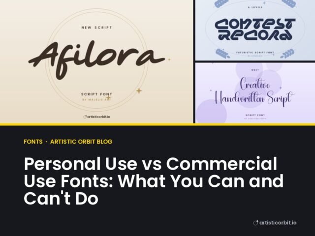
Font Pairing Made Simple: How to Combine Fonts That Work Together

Good font pairing isn’t about finding a secret perfect match. It’s about contrast and restraint. One font does the talking, the other one does the work. Get that right and almost any design looks more professional.
The basic rule: one star, one helper
Pick one font with personality for headlines, the star. Then pick a plain, easy-to-read font for everything else, the helper. The star can be a script, a bold display font or a curvy serif. The helper is almost always a clean sans serif or a simple serif.
Problems start when both fonts try to be the star. Two decorative fonts next to each other fight for attention, and the reader doesn’t know where to look.
Make the difference obvious
Fonts that are almost the same look like a mistake. Two similar sans serifs side by side make people think you changed font by accident. So go for clear contrast in at least one of these:
- Style: serif with sans serif, script with sans serif.
- Weight: a heavy bold headline with light body text.
- Size: a big headline, much smaller text.
- Width: a tall condensed font with a normal-width font.
Eight pairings that almost always work
1. Script + clean sans serif
The classic for weddings, beauty and boutique brands. The script gives feeling, the sans serif keeps the details (date, address, prices) easy to read. Keep the script to a name or a few words. Never set a paragraph in it.
Find both: script fonts and sans serif fonts.
2. Bold serif + simple sans serif
Looks like a good magazine. Strong and trustworthy. Great for editorial design, restaurants, book covers and brands that want to feel established.
3. Heavy display font + light sans serif
For posters, events and YouTube thumbnails. The headline grabs attention from across the room, the light text below explains what it is.
4. Condensed sans + regular sans
Sporty and modern. Tall, narrow headlines fit long words into tight spaces, like sports graphics, streetwear and packaging sides.
5. Retro serif + rounded sans
Warm and friendly, very 2026. Good for cafés, bakeries and lifestyle brands. See our font trends post for more on this style.
6. Handwritten + typewriter
Personal and a bit nostalgic. Nice for journals, planners, scrapbook designs and small craft brands.
7. Elegant serif + spaced-out capitals
Quiet luxury. A refined serif for the brand name with small, widely spaced capital letters for the tagline. Perfect for jewellery, fashion and skincare.
8. One family, two weights
The safest pairing of all: the same font in bold and regular. It can’t clash, because it’s the same design. When a project needs to look clean and you’re short on time, do this.
Mistakes that make designs look messy
Too many fonts
Two fonts is the sweet spot. Three is the limit, and the third should have a clear small job, like numbers on a price tag. Four or more almost always looks messy.
Scripts in all caps
Script capitals are fancy on their own. Putting a whole word in script capitals makes it very hard to read. Use normal capitalisation.
Mixing moods
A horror font next to a cute rounded font confuses the message. Both fonts should suit the same feeling, even if they look different.
Forgetting to test real text
A pairing that looks great with “Lorem ipsum” can fall apart with real names, long words or numbers. Use the live tester on each font page to type your actual words before you download.
A quick way to check your pairing
Step back from the screen, or zoom out to 25%. Can you still tell what’s most important? If the headline still stands out and the body text still looks like calm grey lines, the pairing works. If everything blurs into one busy block, simplify.
Then put it on something real. A pairing on a white artboard feels different on a business card or a package. Seeing it in context shows you instantly whether the sizes are right.
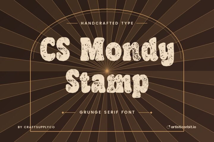
Serif fonts to pair with a clean sans


Quick answers
How many fonts should I use in one design?
Two is ideal: one for headlines and one for everything else. Three at most.
What font goes well with a script font?
A simple sans serif, in a regular or light weight. It balances the script and keeps small text readable.
Can I pair two serif fonts?
You can, but only if they’re clearly different, for example a heavy decorative serif for headlines and a plain, lighter serif for text. Similar serifs together look like an error.